Concept Art Analysis
Concept Art Analysis
Xenoblade Chronicles

The concept art here is concept art created for the 3DS port of Xenoblade Chronicles in 2015. While I cannot find who drew it or exactly when it was drawn, I can make a guess that it was drawn sometime between late 2014 and the release date of the port, that being April 2nd, 2015. The game was developed by Monolith Soft, with the directors being Koh Kojima and Genki Yokota. The company has also worked on the Xenosaga series as well as a small amount of licensed games for other brands.
The strong elements in this design are the main character Shulk with his weapon called the Monado at the front, showing off the most important character in the plot of the game as well as something else of high value to the plot, and the large amount of the colour green as well as the large open area in the distance, showing that the areas in the game are not only covered in nature, but are also large and open to explore.
Persona 5
This artwork was drawn before the release of Persona 5 was created to celebrate the 20th anniversary of the Persona series, that being September 20th, 2016. The artist of this piece is most likely Shigenori Soejima. The game itself was developed by Atlus, with the director and producer being Katsura Hashino. Hashino has also produced games such as every other Persona game between Persona 3 and Persona 5, spin offs included, Catherine and a few other Shin Megami Tensei games, the most notable one being Nocturne.
One of the strong elements in the artwork I can see are the main playable characters standing together at the front and centre. The way they are presented walking away from the city in the background could hint at the group being social outcasts. The large amount of the colour red used could be used to represent the strong desires of the people in the world. The game as a whole has a lot of the colour red anyway.
Comparison
These two pieces of artwork are of two different JRPGS. In the Xenoblade artwork, it just shows off the main character alone in a natural setting whereas the Persona artwork shows off all of the main characters as well as the main one in more of an urban setting. This goes side by side with the settings of each game.
Both artworks show the characters separated from the rest of the world they're in. The Xenoblade artwork shows the main character by himself away from the rest of his village, whereas the Persona artwork shows the main cast separated from the big city in the background. This is most likely done to show that the characters stand out from the rest of their worlds.
Super Smash Bros.
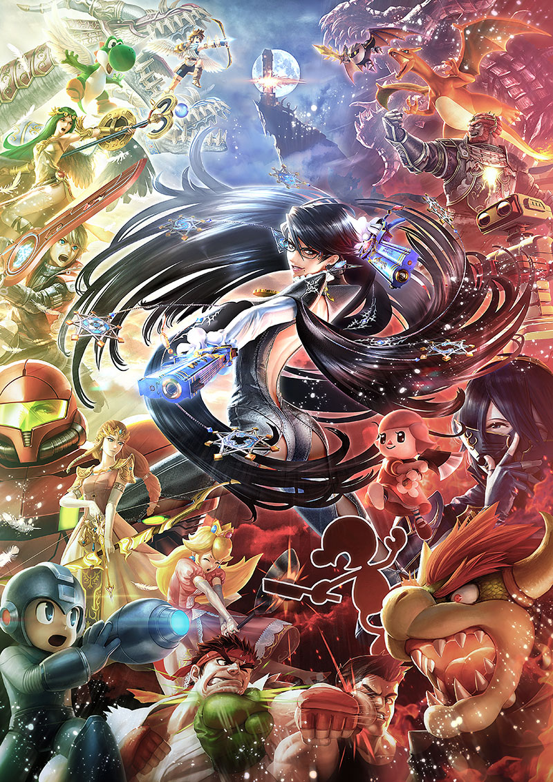
This artwork was created sometime in 2015 to promote the DLC character Bayonetta (in the centre of the image) in the game Super Smash Bros. Wii U/3DS when she was revealed in 2015. The artwork was drawn by Eiji Funahashi of Platinum Games, the company that originally created Bayonetta. The game this is based on, that being Smash Bros., was developed by Sora Ltd. and Bandai Namco Studios with the director being, of course, Masahiro Sakurai who has previously worked on the Kirby series and the game Kid Icarus Uprising. He also voices the character King Dedede in Smash Bros.
In the artwork itself, I can tell that the lighter characters are on the left, while the darker characters are on the right. The characters aren't separated by good and evil, just the overall tone of their designs. The character Bayonetta is visibly larger than the rest of the characters featured and is also in the centre of the artwork to show her importance as this is her promotional artwork, after all. Bayonetta is seen doing her signature spin attack with her guns.
Dragon Ball Z: Battle Of Gods
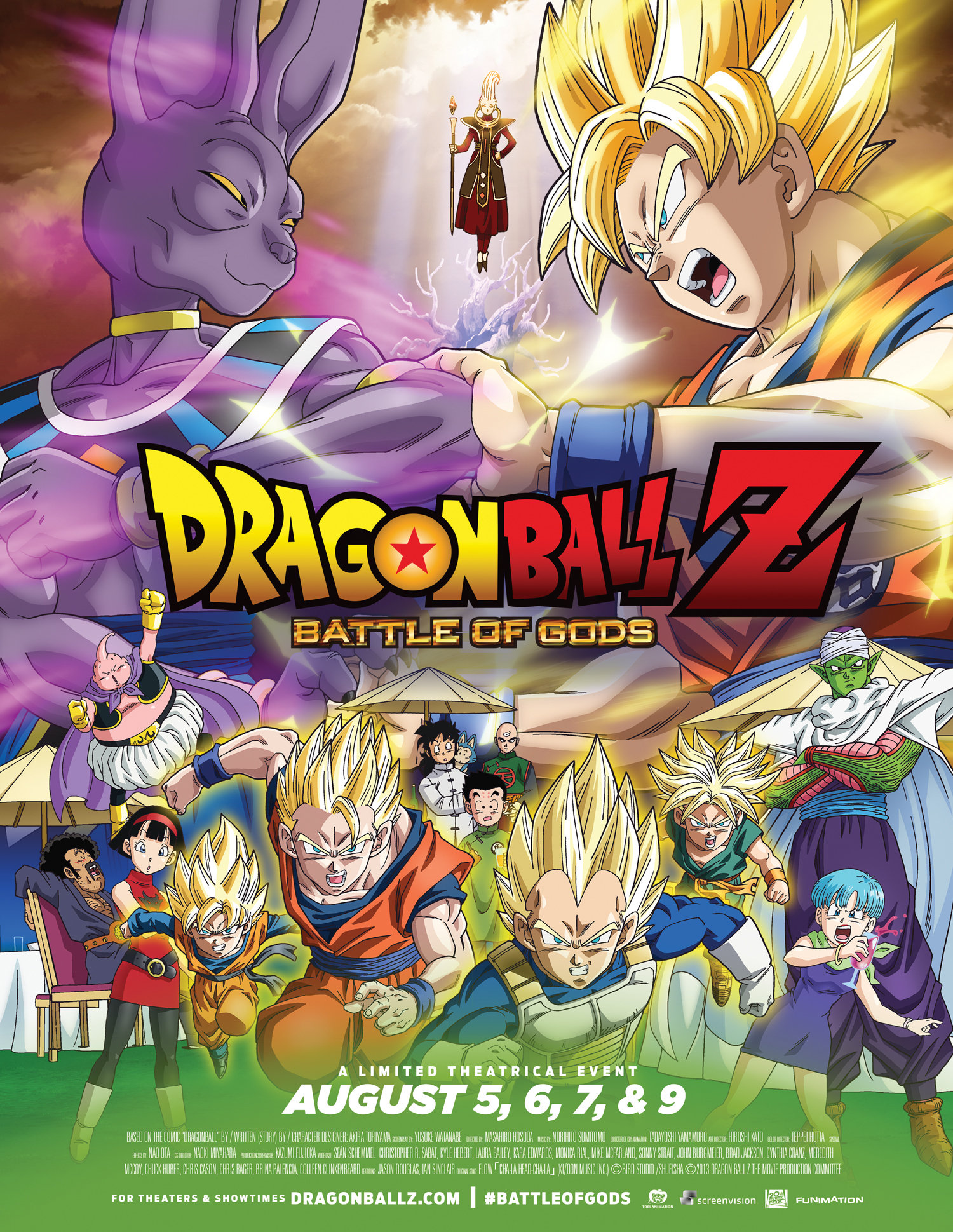
This artwork is a promotional poster for the movie Dragon Ball Z: Battle Of Gods released in 2013. I am unable to find who drew this exactly, but it is most likely Hiroshi Kato, as he is the art director of the movie. The movie was directed by Masahiro Hosoda, who has directed movies for other anime series such as Sailor Moon and Kaiji.
In the artwork, the two most prominent characters shown are the main character Goku and the new villain of the movie Lord Beerus, with the less prominent characters towards the bottom. The two characters have their most prominent colours coming out of them with the colours clashing onto each other. The character Whis is between them who could be seen as a sort of referee for the fight.

In the artwork, the two most prominent characters shown are the main character Goku and the new villain of the movie Lord Beerus, with the less prominent characters towards the bottom. The two characters have their most prominent colours coming out of them with the colours clashing onto each other. The character Whis is between them who could be seen as a sort of referee for the fight.
Comparison
Both of the artworks depict a fight going on between two sides, with another character between it. The Dragonball artwork just depicts a fight between two characters with another in the middle just watching from afar, whereas the Smash Bros. artwork shows a fight going on between two sides, as if it is a massive war with the character in the middle looking like she is joining in with it.
In the Dragon Ball artwork, the side characters are placed there just to be out of the spotlight, as the main focus is to be on the two characters shown at the top. Meanwhile, the main focus of the Smash Bros poster is on the character in the middle. While the other characters there aren't the centre of attention, they still aren't as out of focus as the ones on the Dragon Ball artwork as there is still some action going on with them.
Devil May Cry 3

This artwork is the cover of the Japanese release of Devil May Cry 3 Special Edition, which originally came out in Janurary 24th, 2006. Oddly enough, the special edition of the game was released in North America first and then Japan in February 23rd, 2006. While I cannot find exactly who made this artwork, a safe bet would be Daigo Ikeno, as he was the lead artist for the game. The game was developed by Capcom and directed by Hideaki Itsuno, who had previously worked on a few Capcom crossover games and a few licensed games for some manga series.
The art itself features the two characters Dante and Virgil fighting each other. It is shown from a perspective over Vergil's shoulder to give us a view of Dante's face. This is done because he is the main character. There is a bright spark where the swords clash to show the power of the characters. It also shines a light on them so they can actually be seen.
JoJo's Bizarre Adventure

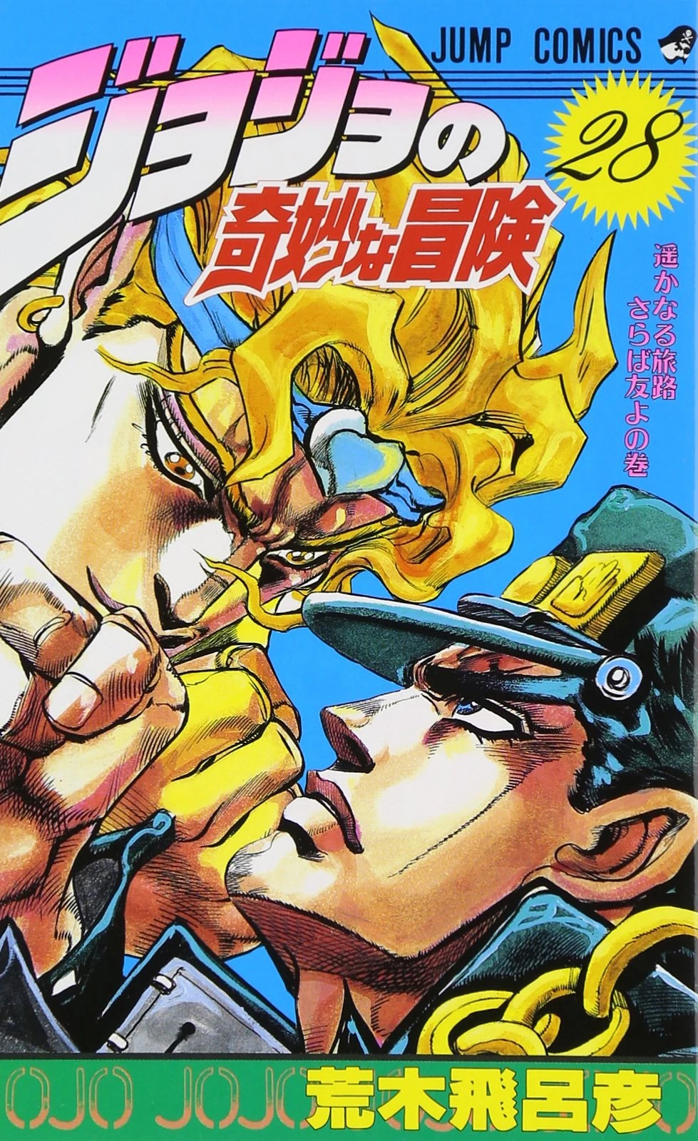
This artwork is the cover of the final volume of the JoJo's Bizarre Adventure: Stardust Crusaders manga. It was originally released in August 4th, 1992 and was created by Hirohaki Araki. Araki had also created the rest of the JoJo's Bizarre Adventure series and had previously created other manga such as Baoh. Since this is a manga, (A Japanese style of comic which are usually drawn in black and white and are read from right to left) Araki did all of the drawings which includes the artwork shown here.
The artwork depicted here shows Jotaro Kujo at the bottom facing off against Dio Brando at the top, who are the protagonist and antagonist of this story arc respectively. Dio's placement at the top represents the control he has over not only Jotaro, but the whole world due to the power he has. The brighter yellow colours on Dio could show that Dio's powers are that of Gods, since brighter yellows are usually associated with holy entities. The brighter colour could also present Dio as a wealthy man and the darker colour on Jotaro could present him as a lower street thug.
Comparison
The two images depict two characters battling it out. The Devil May Cry artwork shows Dante and Vergil fighting, and the JoJo artwork shows Jotaro and Dio fighting. In the two artworks, both characters could be considered rivals to each other, so the two fights shown in the artworks are both really personal battles.
The differences between the artworks are how each of the characters are presented to each other. The Devil May Cry artwork shows the two characters at a similar level, implying that the two are equals to each other. The JoJo artwork depicts Dio over Jotaro, which could imply that Dio's power is far greater than that of Jotaro's.
Spiderman

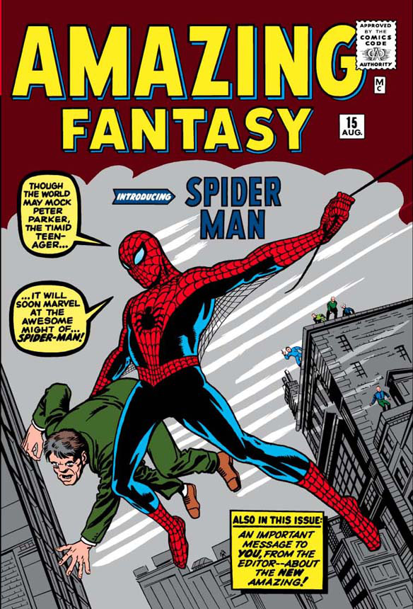
This artwork is the cover of one of the earlier Spiderman comics originally released sometime in 1961. The artwork was drawn by Jack Kirby, who had previously worked on character design, artwork and some other covers for Marvel and DC comics alike. The comic itself was created by Stan Lee who was the co creator of Marvel as a whole, who had created characters such as the Fantastic Four, Spiderman himself, the X-Men, Daredevil, Hulk, Thor and the Avengers.
The artwork itself depicts Spiderman with a regular human who he seems to be saving. Spiderman is addressing his alter ego Peter Parker, saying that people will make fun of him, but instead be amazed by him as Spiderman. It also shows off how Spiderman is supposed to be a spider. This is done by the spider symbol on his chest, the web between his arms and his use of his signature spider web swing power.
The artwork itself depicts Spiderman with a regular human who he seems to be saving. Spiderman is addressing his alter ego Peter Parker, saying that people will make fun of him, but instead be amazed by him as Spiderman. It also shows off how Spiderman is supposed to be a spider. This is done by the spider symbol on his chest, the web between his arms and his use of his signature spider web swing power.
Guilty Gear Xrd Revelator
This artwork is the cover of the Guilty Gear Xrd Revelator special edition released only in Japan. While the arcade version of this game came out on August 25th, 2015, the console version came out in Japan on May 26th, 2016. Since this is the artwork for the special version released on PS3, I think its safe to assume the artwork was created then. While I cannot find out exactly who drew this, I think a safe bet would be Hidehiko Sakamura, due to him being the lead artist. The game was developed by Arc System Works, and was directed, designed, written and composed by Daisuke Ishiwatari, who also wrote some of the music for BlazBlue.
The design itself is a heavily stylized drawing of the character Sol Badguy (Who is also voiced by Ishiwatari) that goes with a style that resembles sparks on metal, which could have been done to go along with the metallic looking art style of the game. Another feature of the artwork that I noticed is that the shape of the drawing actually resembles some of the characters in the game.
Comparison
The two artworks shown here both present the main protagonist of each series presented and they both show of what each is known for. The Spiderman comic shows off his most well known power, and the Guilty Gear artwork is drawn with the metallic aesthetic that the series is known for.
Both artworks differ in many ways. The Spiderman artwork shows off exclusively the main character drawn in the same art style the comic is drawn in and it shows Spiderman using one of his powers, whereas the Guilty Gear artwork is a close up of the main character's face drawn in a style similar to the menu UI of that game, rather than the style used in the game itself. The Guilty Gear artwork also shows outlines of other characters from the same game around the face of the main character.


Comments
Post a Comment