Task 3
Task 3 Analysis
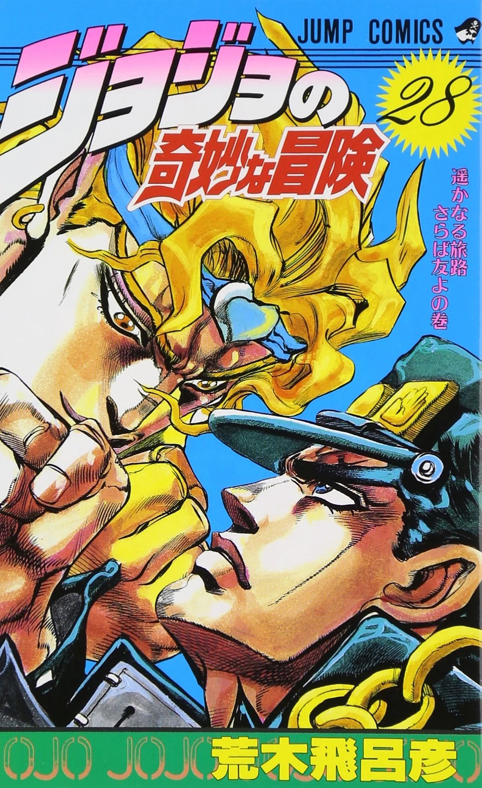
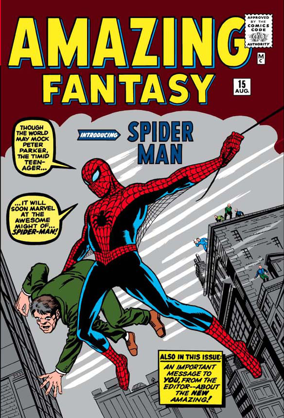
The artists I chose to replicate the artworks of are Hirohaki Araki and Jack Kirby. I replicated the cover of Volume 28 of JoJo's Bizarre Adventure: Stardust Crusaders and the cover of Volume 1 of the Amazing Spiderman Omnibus. I made sure to plan ahead on what artworks to replicate. I made sure to do one example of western artwork and one example of Japanese artwork. To create the replications, I used regular pencils and pencil crayons. I did the drawings in my sketchbook. I tried just looking closely at the artworks and copying them down onto the paper. Not really much other techniques used. While the replications aren't 100% accurate to the source material since I'm only human, I personally believe the drawings themselves are of high quality.
The first image I tried to replicate was the cover of Volume 28 of the JoJo's Bizarre Adventure: Stardust Crusaders manga. I feel that I have accurately portrayed the positions the characters are in and some of the other details too, such as the shading and the details on the faces. However, the hand of the character on the bottom is not the correct size. Due to this, less of the character on the top's face is covered up so I had to compensate by drawing the rest of his mouth and his jawline. Also, the colours used are not 100% accurate. and some of the shading of the character's clothing is inaccurate. I also purposefully didn't include anything from the cover apart from the two characters, since they are what I wanted to focus on.
The second image I tried to replicate was the cover of Volume 1 of The Amazing Spiderman Omnibus. I think I was able to replicate the position the characters are in quite decently and I think I copied some of the details on the characters quite well. However, the shape of Spiderman's head is noticeably thinner, while the shape of his body is noticeable thicker. The shape of the other man's head is also less sharp that it should be. While I copied some of the details well, any details revolving around the shading of colours I did not do, due to me not knowing how to properly do it as of now. Like with the last piece, I left out everything that isn't the characters.
Overall, I think I replicated the images pretty well. Though, if I could do them again, I will make sure to make the drawings themselves bolder before I colour them in, since some of the details are unrecognizable due to being drawn on too lightly. Speaking of colouring in, that is something I should work on more. I was using the incorrect technique to colour the pictures in as you can clearly tell that not 100% of the shapes were filled in. Though I do know how to colour properly now, I would have preferred it if I did so when creating these pieces.


Comments
Post a Comment