Artist Artwork Analysis
Artist Artwork Analysis
Hirohiko Araki
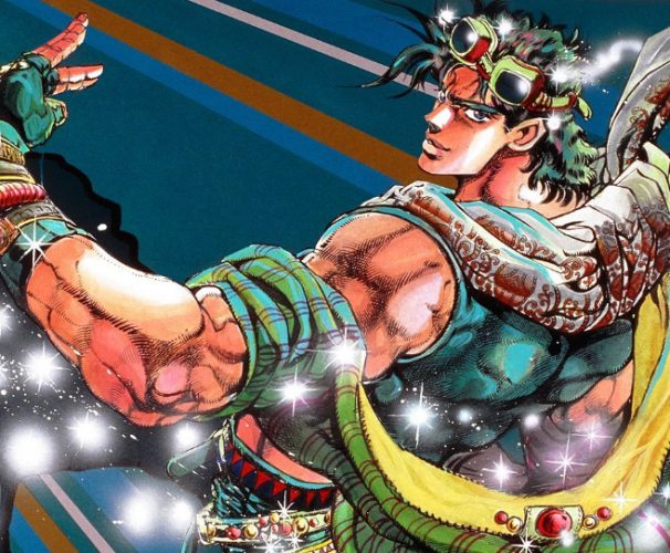
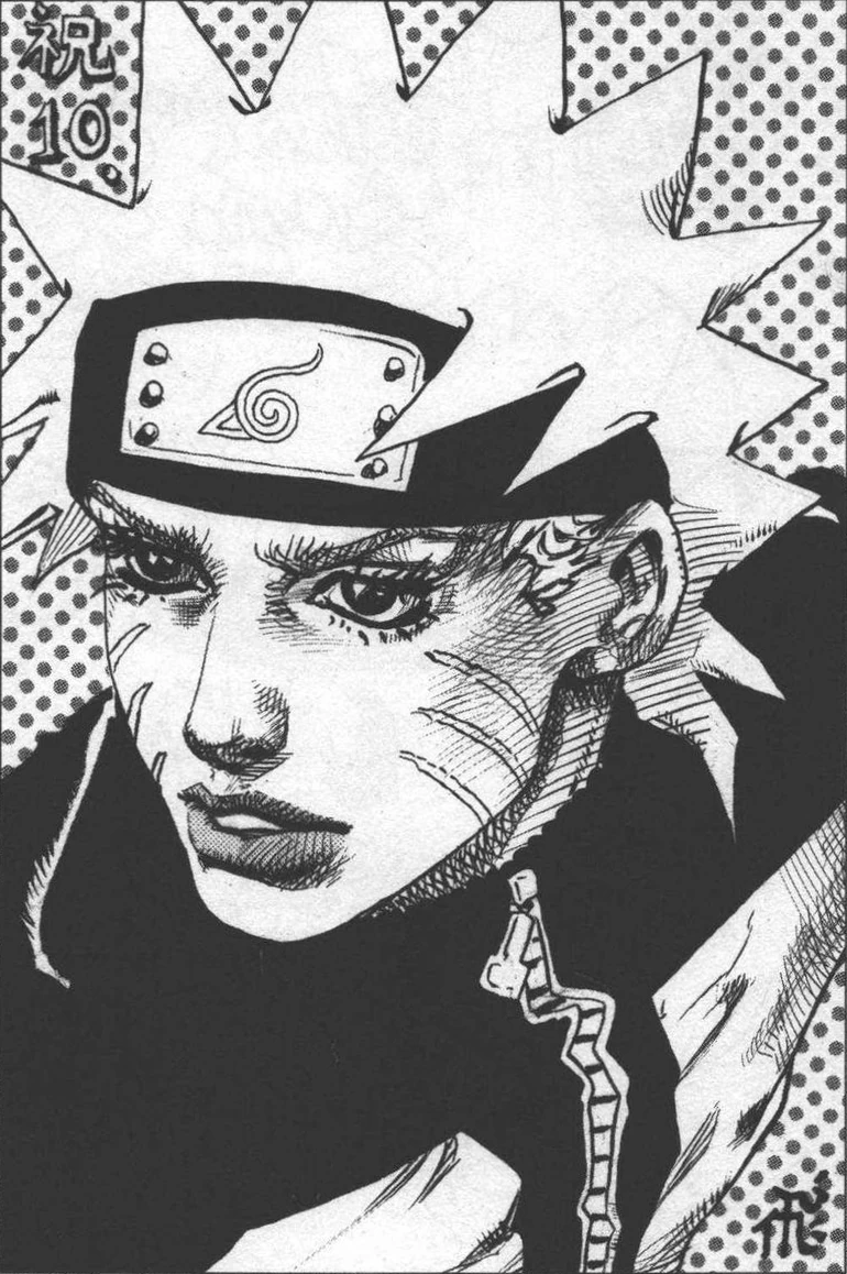
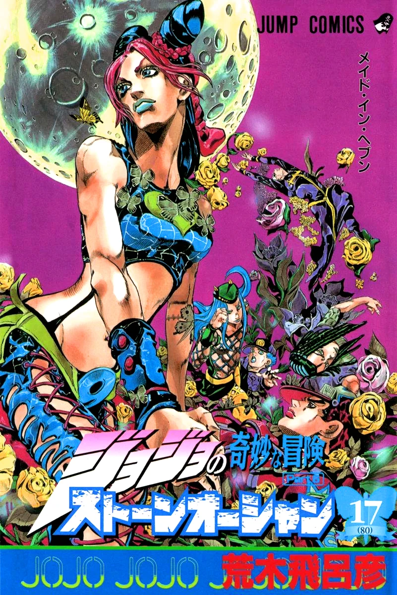
Araki has a very distinct art style. The look of the character's faces looks pretty realistic compared to most other manga. The characters also have a very masculine look to them, while also appearing flamboyant due to the bright colours and extravagant poses he usually draws the characters in. Most of the art drawn by Araki is for his JoJo's Bizarre Adventure series which is well known for the usual traits of Araki's art style. However, as you can see with the image on the bottom right, that being the first manga cover of JoJo, you can tell that Araki's style didn't start off this way. The style isn't as realistic or flamboyant, but it seems rather expressive.
Jack Kirby
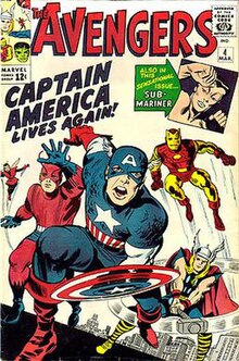
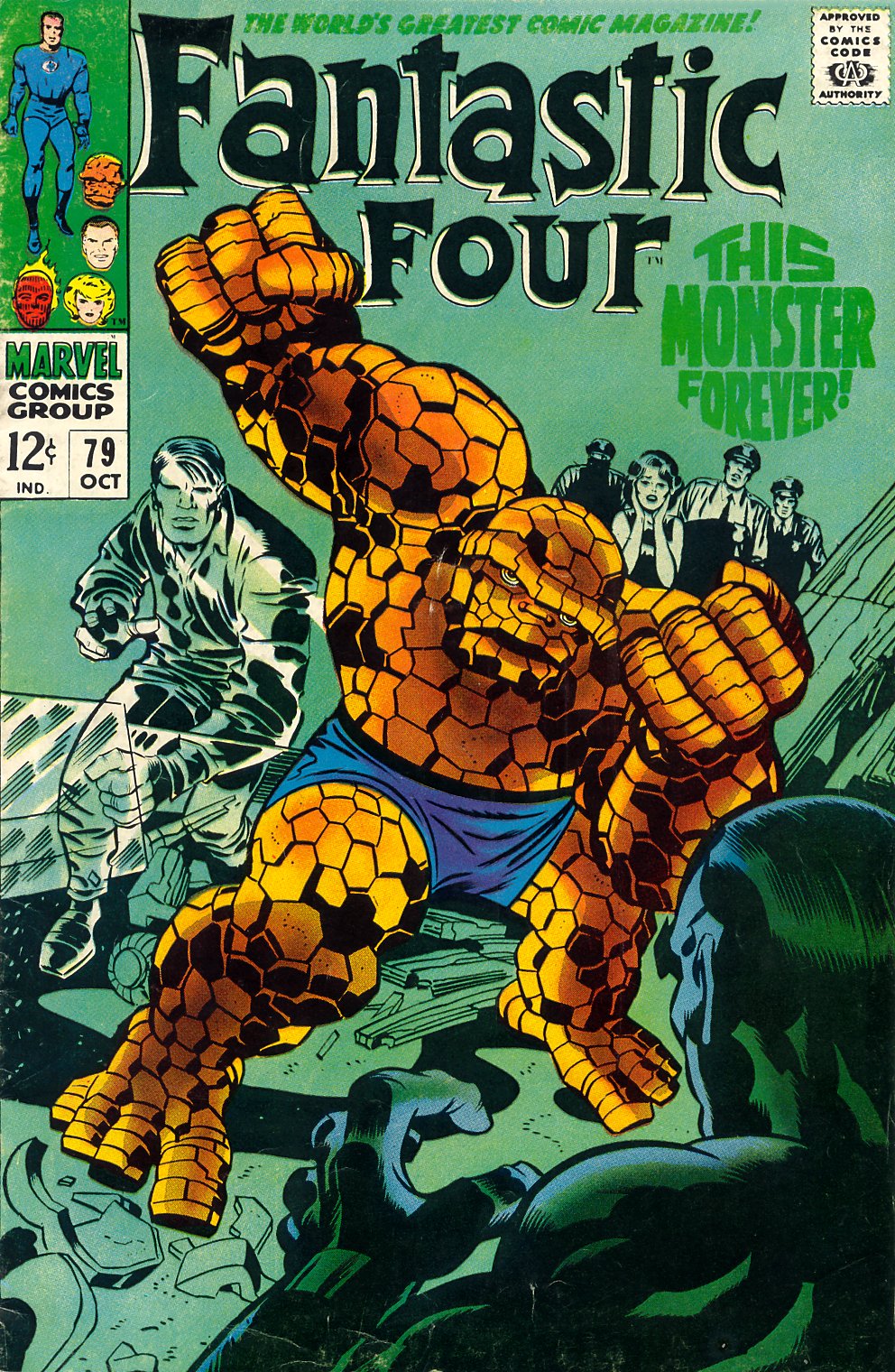


Jack Kirby's art style is also a relatively realistic style. His style is the style usually associated with super hero comics today. The characters he draws usually have detailed muscular bodies which is probably done to present the characters as strong since they usually tend to be super heroes.The characters he draws have simple designs that tend to use no more than three different colours. Jack used to do art for Marvel Comics and DC Comics before passing away on the 6th of February, 1994.
Comparison
The two artstyles are similar in a lot of ways. They both go for a more realistic approach with the characters and draw the male characters with muscular builds. Both styles have a good amount of detail in the faces and bodies and both styles present the characters in poses showing off their powers and their personalities.
However, the two styles differ in some ways. Kirby goes for a more bold approach for shading in the characters whereas Araki makes it look more natural. Araki's poses are drawn much more flamboyantly and expressively, whereas Kirby's poses
look more natural. They look more like poses the characters would do when in action, rather than showing off.
Daigo Ikeno
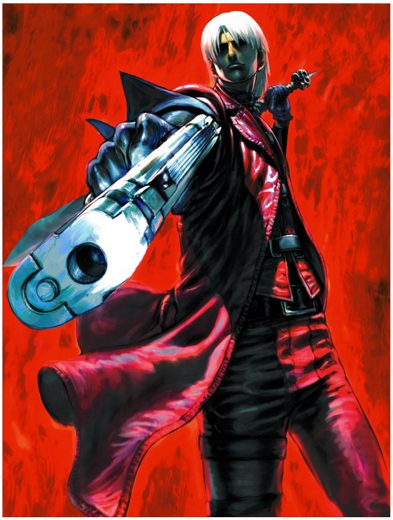
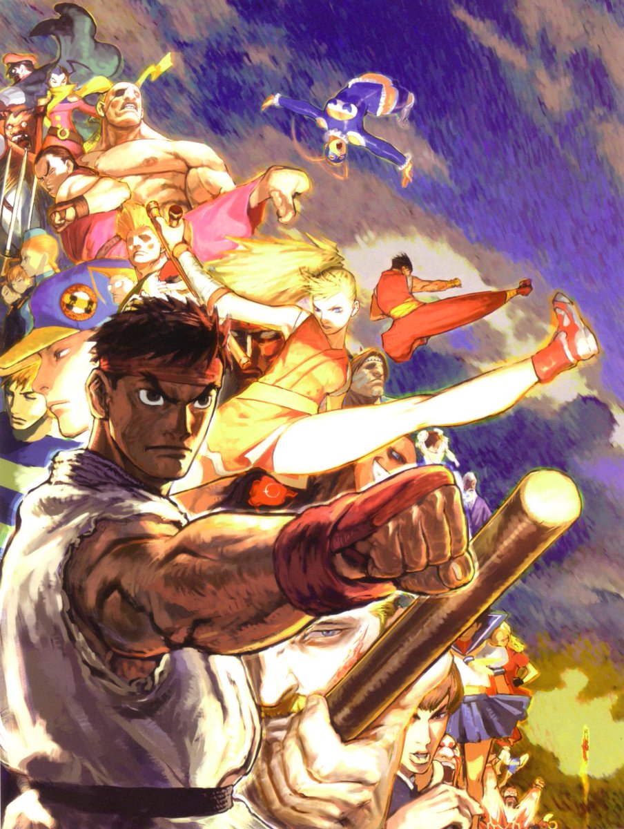
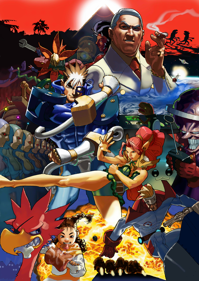
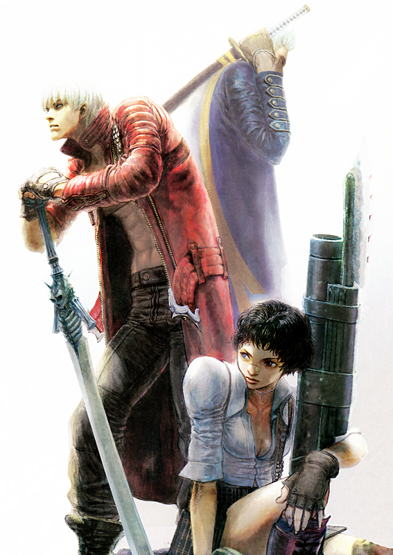
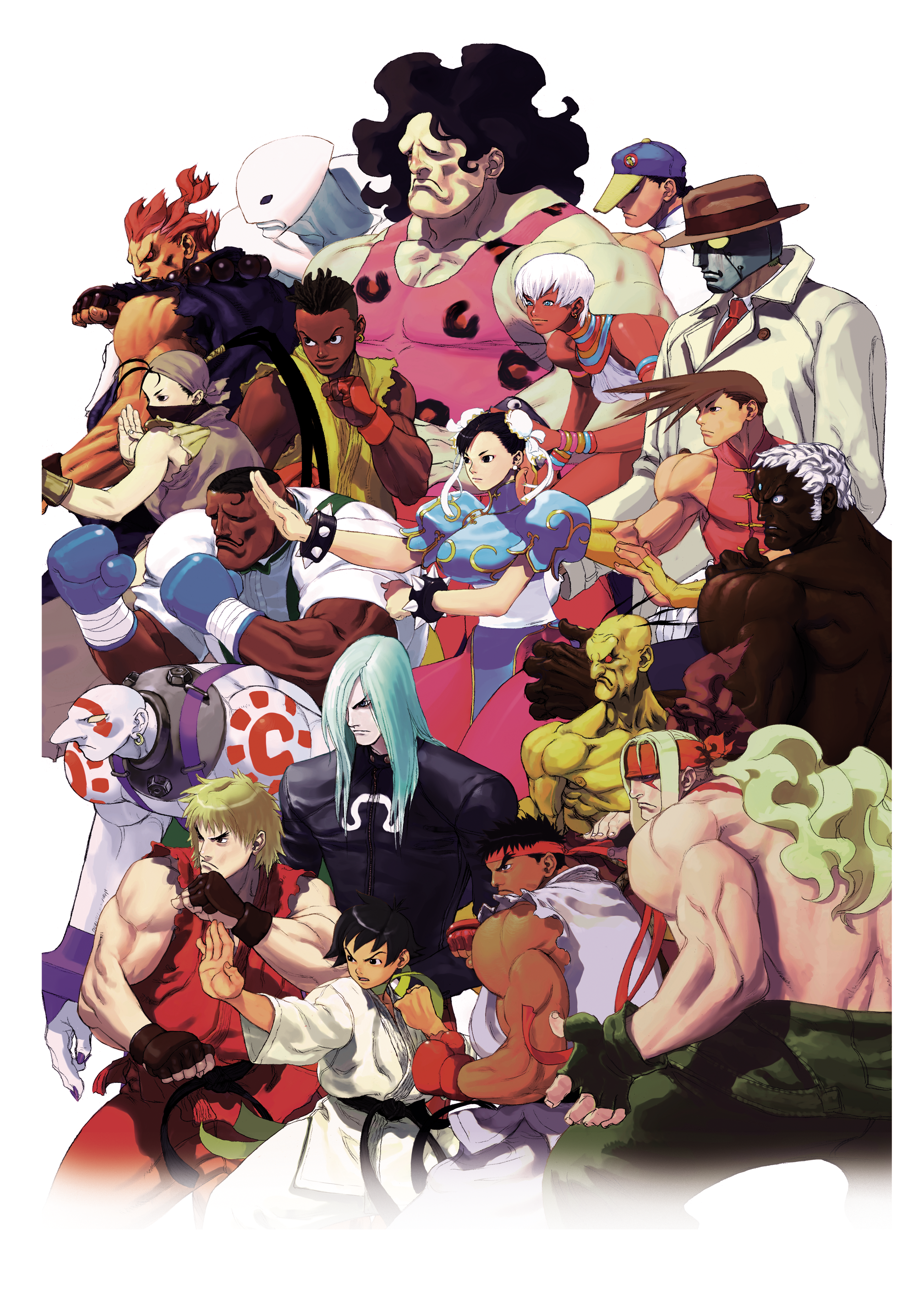
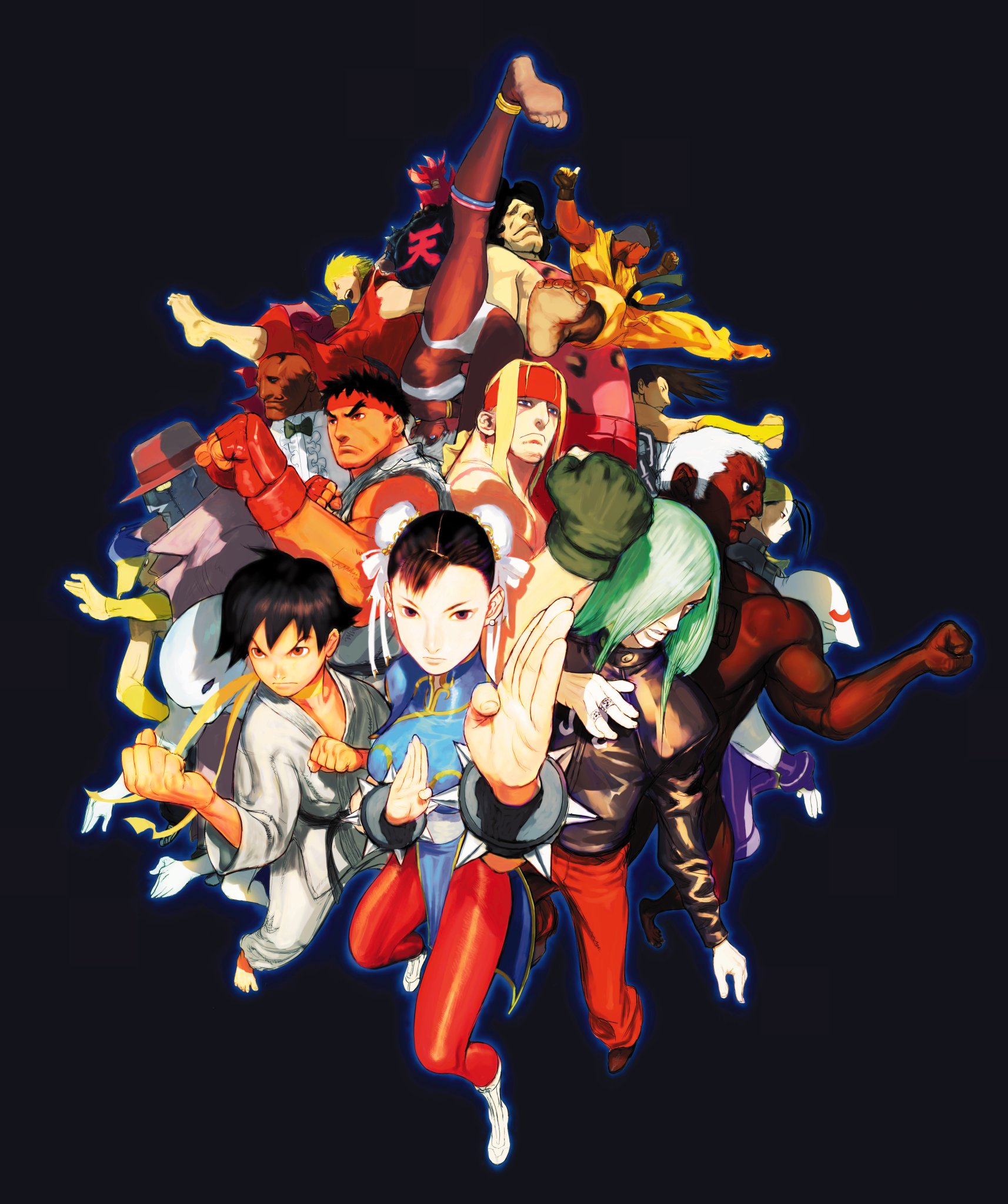
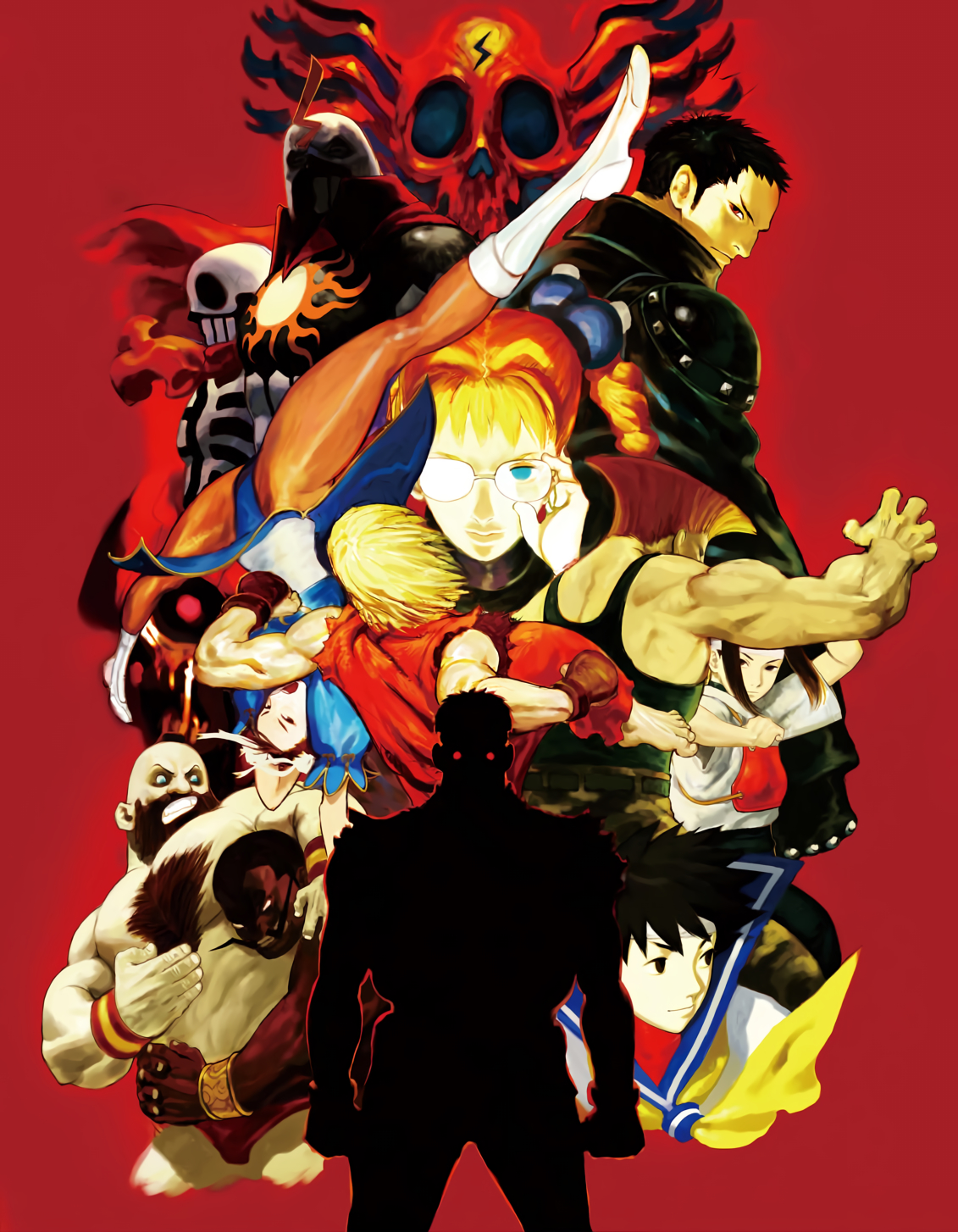
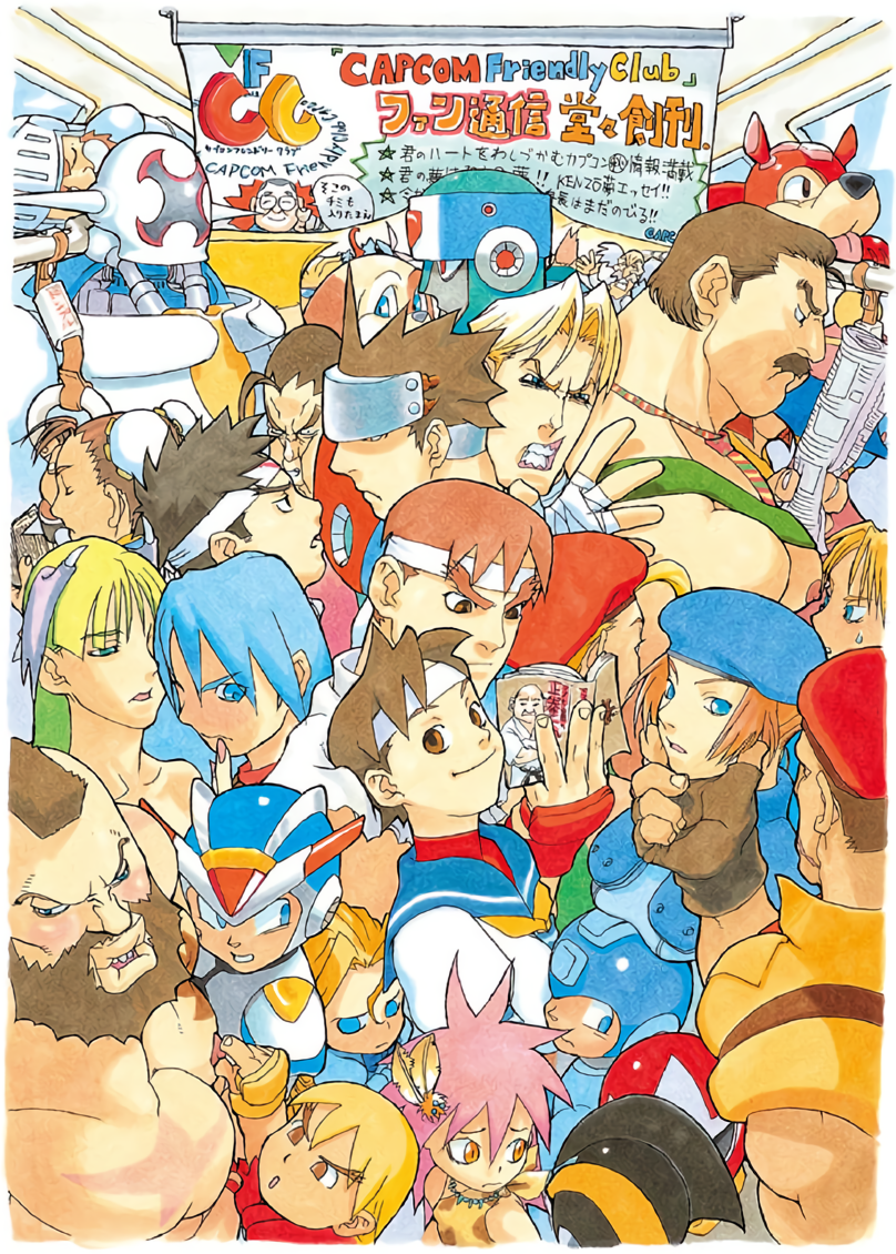
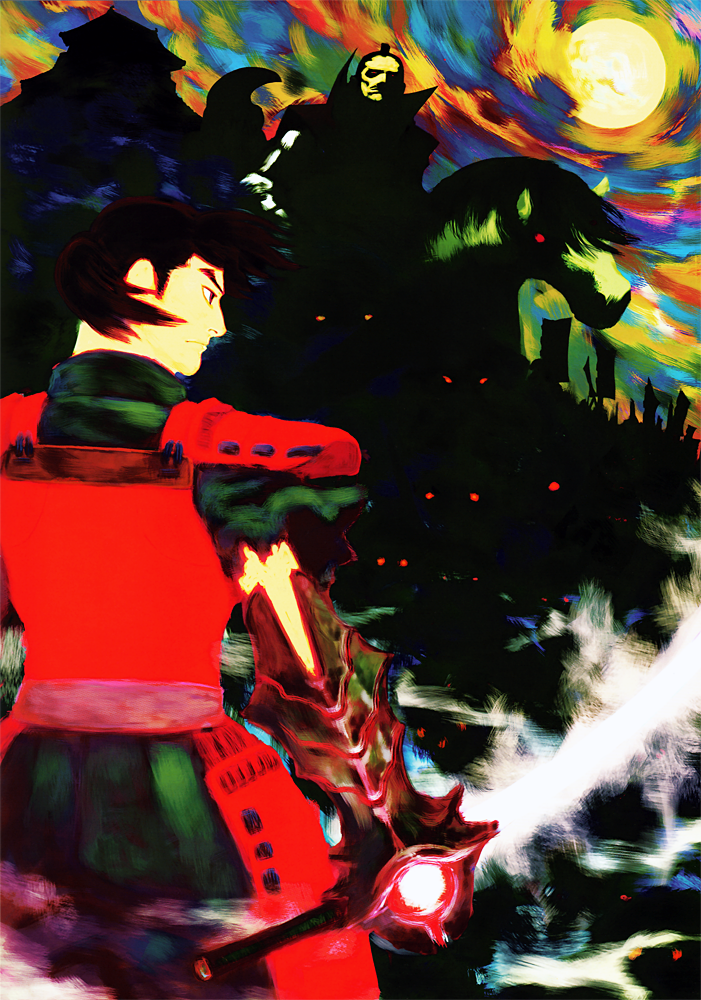
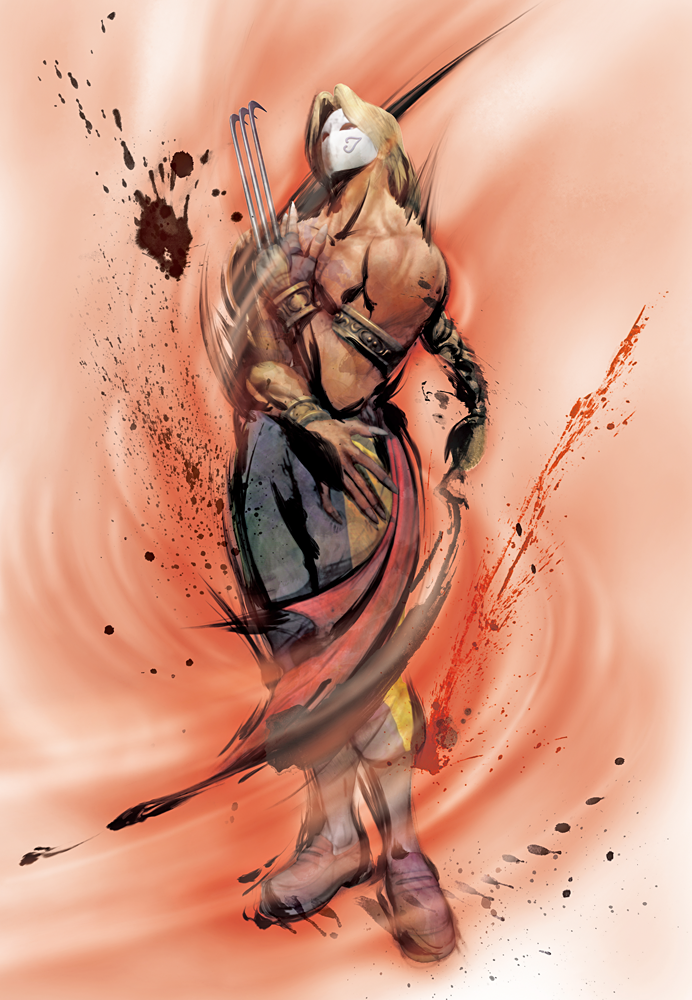
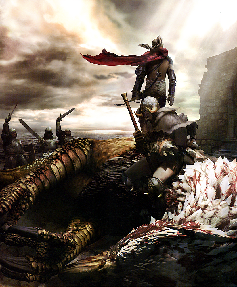
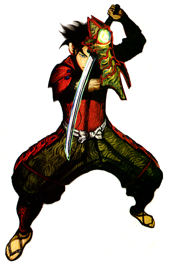
Daigo Ikeno's art style appears to be quite varied. From what I can tell here, he can do a different style based on what game his artwork is based on. He could do a more realistic look or a more anime inspired look. But in general, it seems Ikeno is more comfortable with realistic looking proportions while also using some darker colours to make the brighter ones stand out more. He also seems to be comfortable with using varied colours, too. Since Ikeno is one of the lead artists working at Capcom, I feel it is good that he has a varied art style since he can do artwork for pretty much all of Capcom's games.
Shigenori Soejima

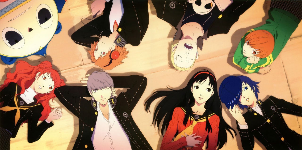
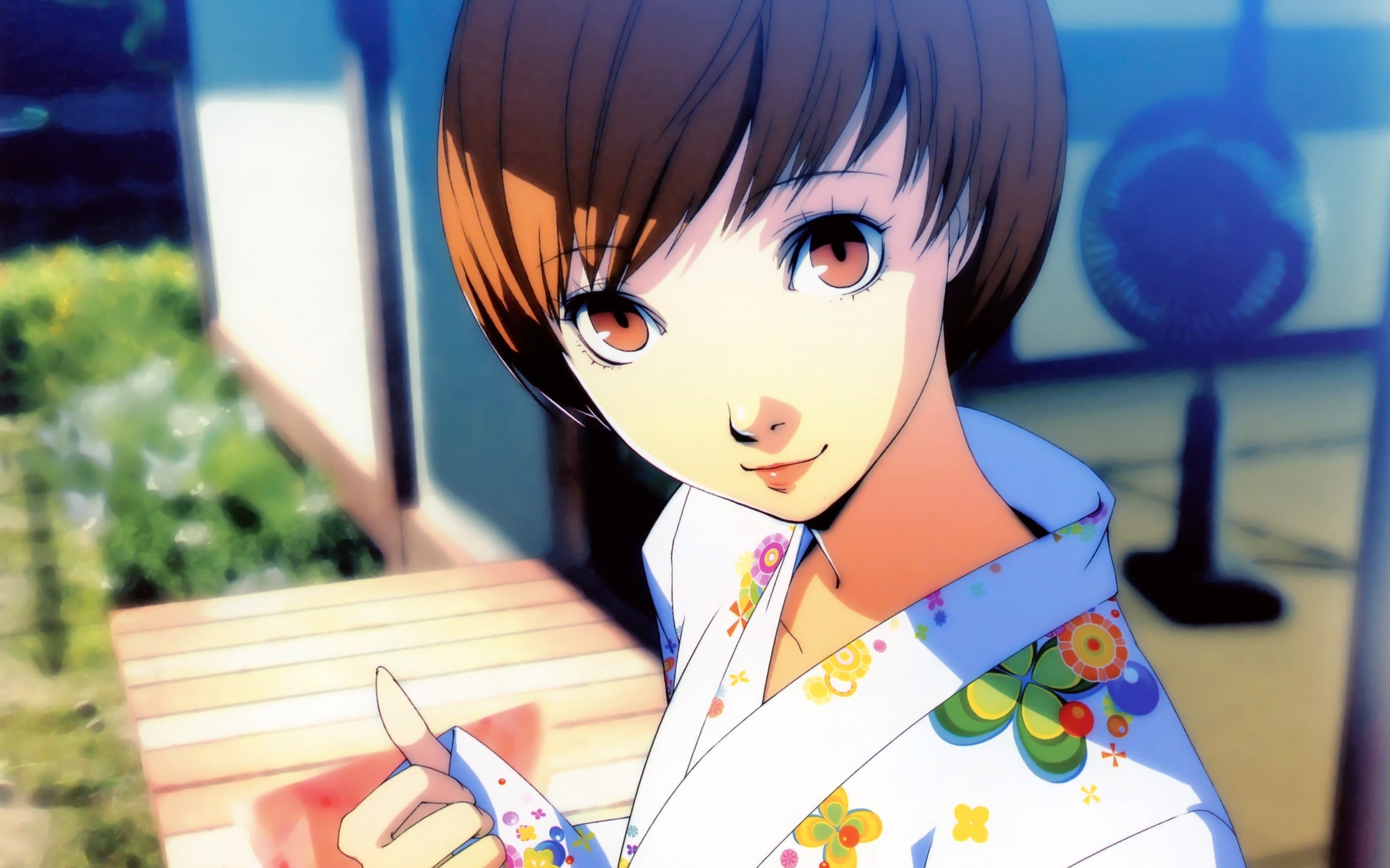
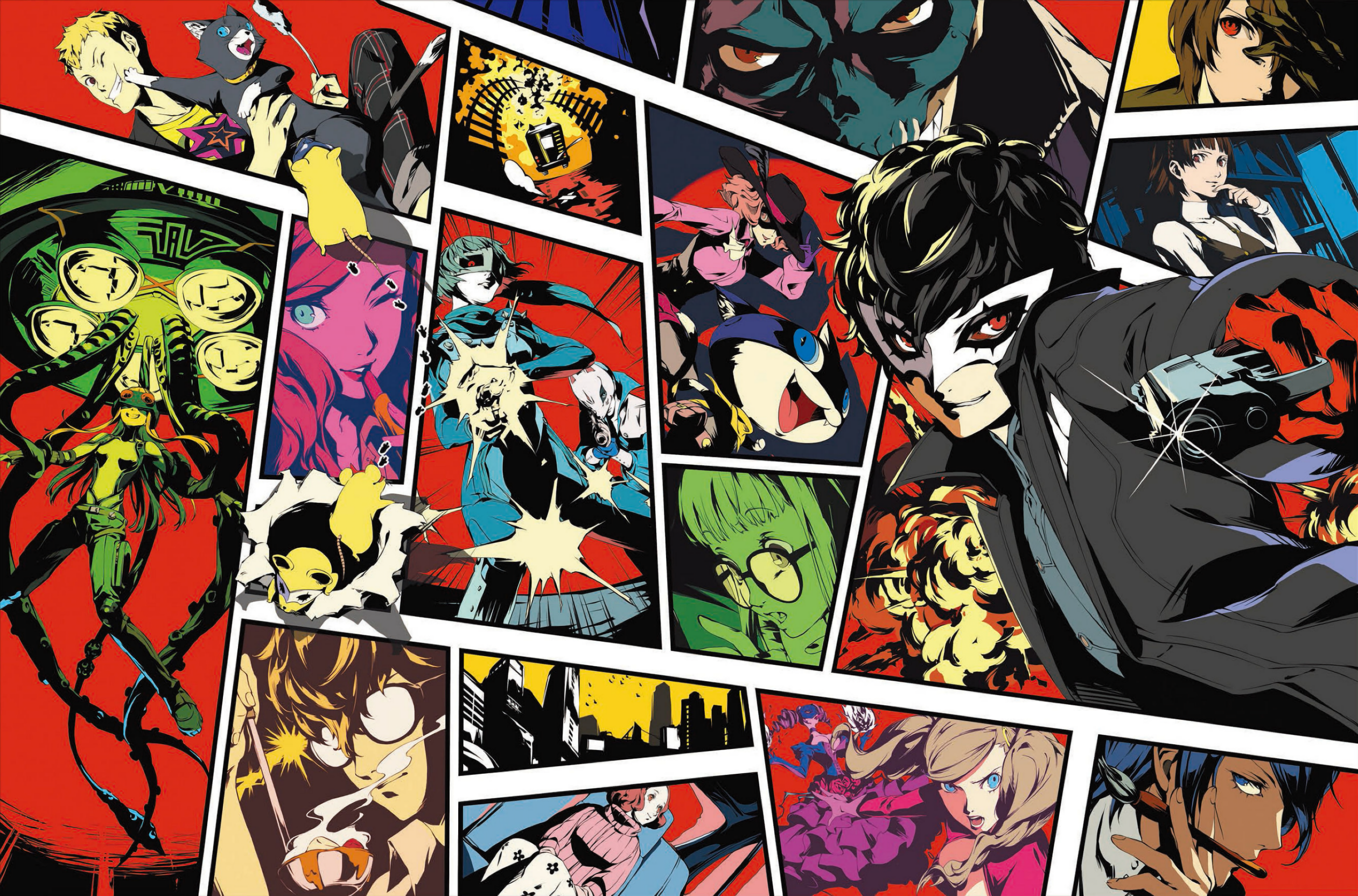
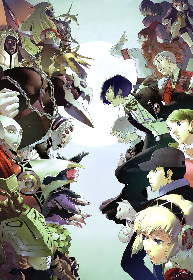
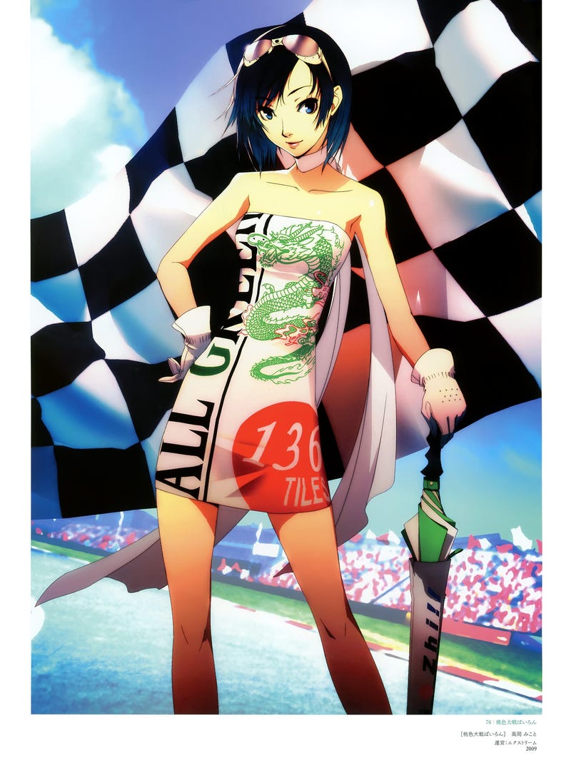
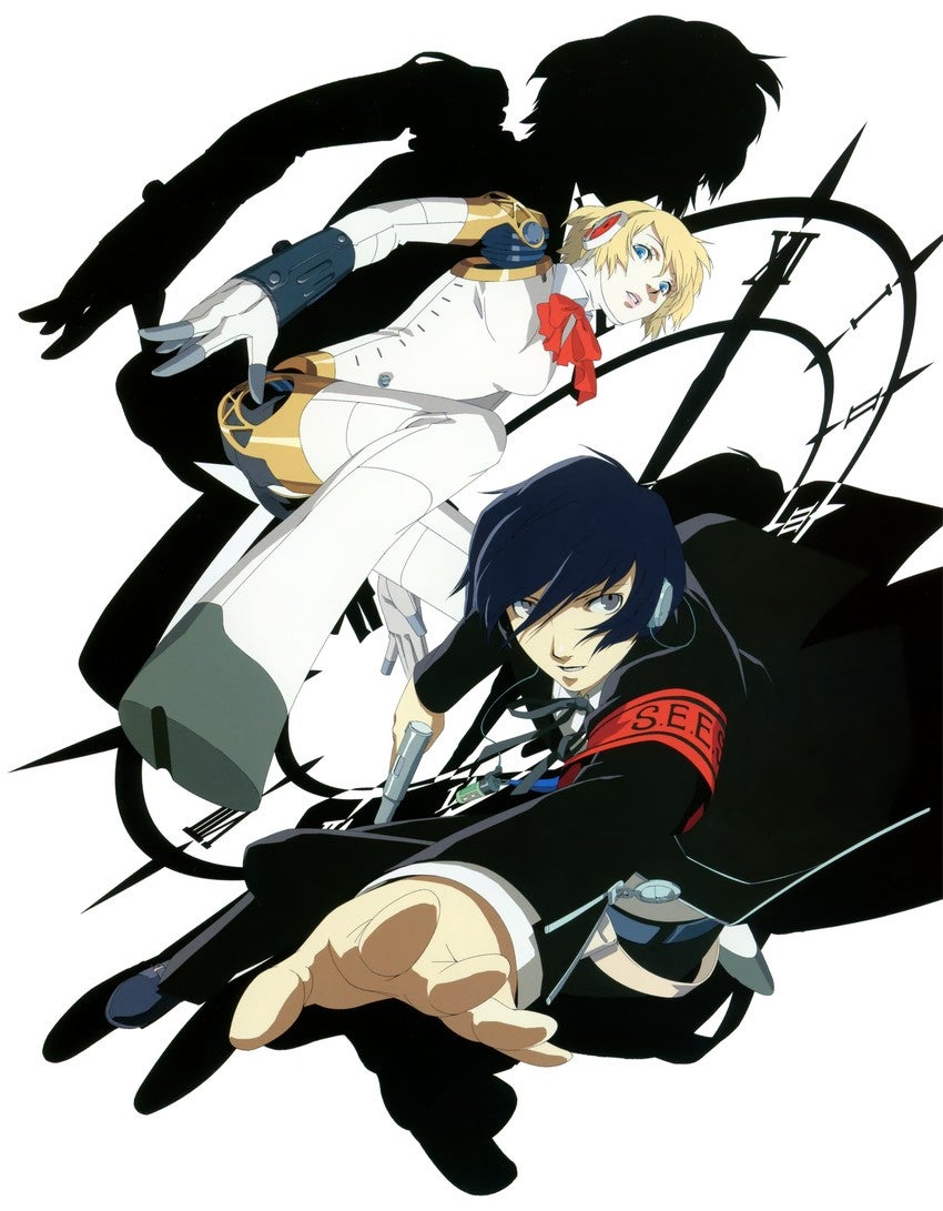
Shigenori Soejima's art uses a pretty simple looking anime style that appears to be a sort of blend between a more realistic art style and an anime looking art style. He uses bold colours on some of his character designs to make them stand out more while also using bold colours on the artworks themselves to, again, make them stand out. A word that could be used to describe his style would just be smooth. The shapes he uses look really smooth combined with the bright colours. Soejima does art for the Persona series as well as art for some other games by Atlus.
Comparison
Both artstyles present the characters drawn in more down to earth poses. Nothing too flamboyant, just poses that I could imagine the characters actually doing. The two artstyles also go for a more realistic approach when drawing rather than cartoony.
Daigo goes for a more natural and realistic style when colouring in and shading his drawings. His colouring style is more natural than Soejima's bolder approach to this. Soejima's colouring and shading is completely bold to make it stand out more. He goes for a more stylish artstyle than Daigo's realistic artstyle.







Comments
Post a Comment